
Customizing Your Funnel and Website for Mobile and Desktop Views
The funnel and website builder allows you to tailor designs for both desktop and mobile views. Here’s a guide on how to customize your funnel or website for each view, including using Mobile Only or Desktop Only sections and adjusting margins.
Using Desktop and Mobile Only Sections
Purpose
You can create sections, rows, columns, and elements that are visible only on desktop or mobile views. This is useful for optimizing layout and design for different devices.
Recommendations
Avoid Excessive Use: Avoid using Mobile Only or Desktop Only sections excessively, as changes in one view do not automatically update the other. This can lead to redundant work.
Build Desktop First: Start by designing the desktop version, then switch to mobile view to make necessary adjustments.
Steps to Set Sections as Desktop Only or Mobile Only
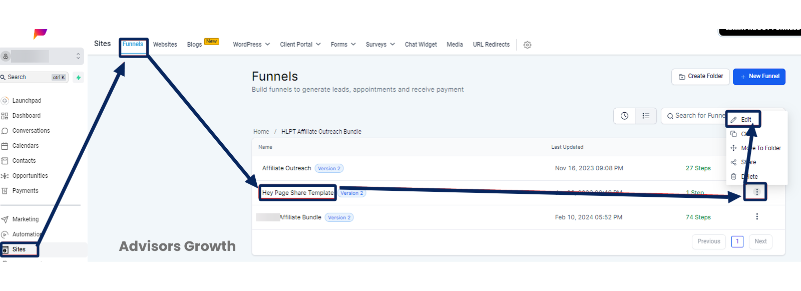
Click the Edit Icon: Open the funnel or page you want to edit.
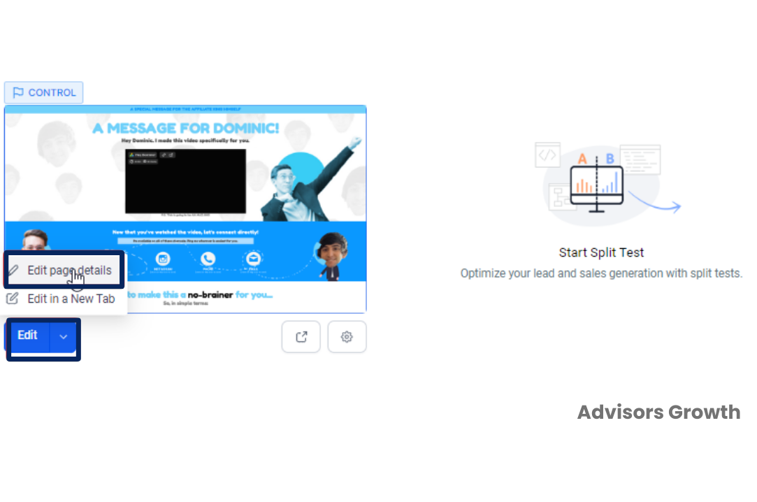
Edit Page: Click the blue "Edit Page" button.
Select the Element: Choose the element you want to modify.
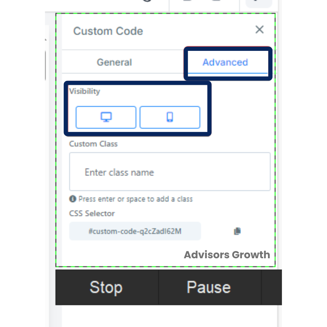
Advanced Settings: Go to the element’s "Settings" tab, then click on "Advanced".
Visibility Settings: Under "Visibility", toggle the desktop and mobile icons to show or hide the element in respective views.
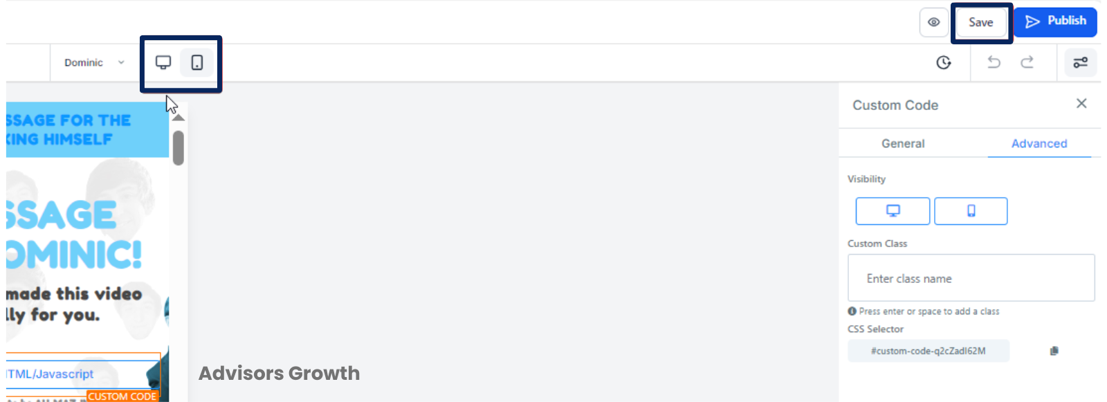
View Optimization: Use the desktop and mobile icons in the top menu bar to preview the optimized pages.
Save Changes: Ensure to save your changes before exiting.
Note
Font sizes can have separate settings for desktop and mobile views, allowing simultaneous adjustments.
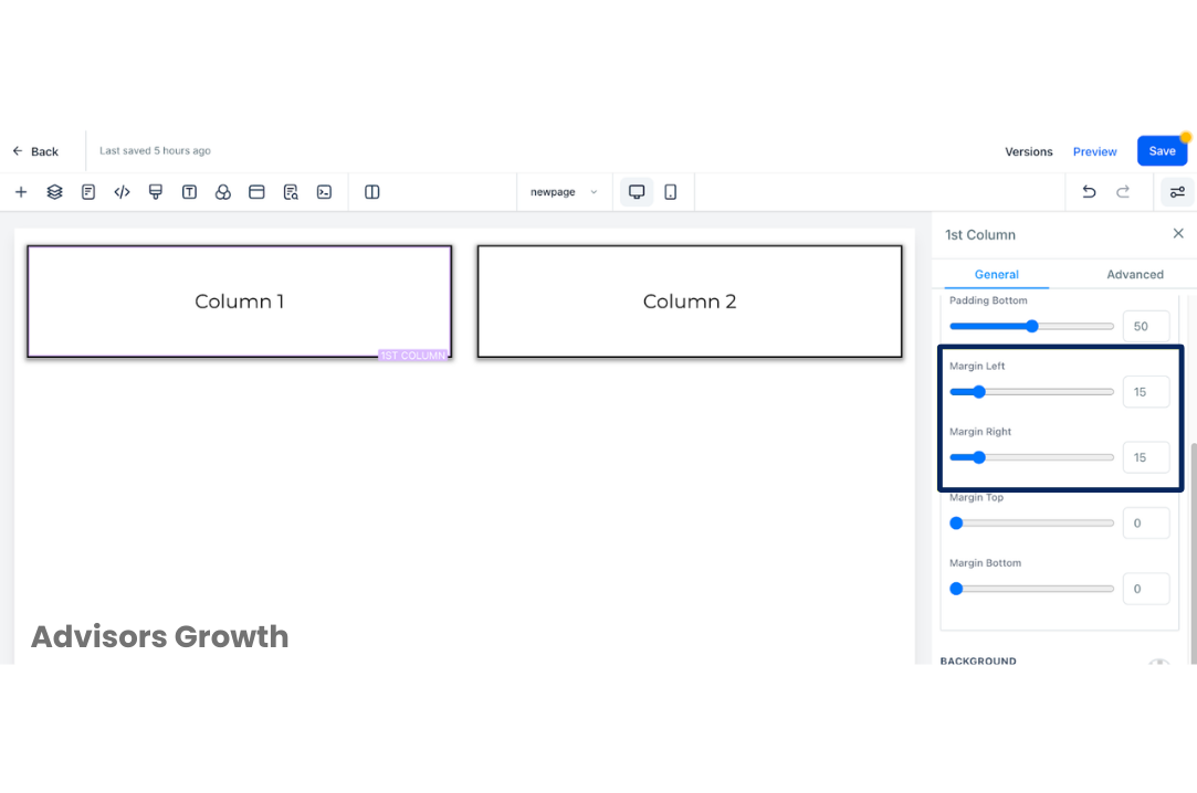
Margin Left & Right for Column Elements
Purpose
The Margin left and right option allows you to adjust the spacing of columns to enhance layout and visual appeal.
Steps to Adjust Margin
Access the Builder: Log in and navigate to the Funnel/Website Builder section where you want to adjust column spacing.
Select the Column: Choose the column for which you want to adjust spacing.
Open Column Settings: Click on the column element to open its settings menu.
Advanced Settings: Go to the "Advanced" tab or option within the settings menu.
Activate Margin Settings: Find and activate the Margin left and right option.
Adjust Spacing: Use input fields or sliders to specify the amount of spacing. Adjust according to your design needs.
Preview and Fine-Tune: Check how the changes affect the layout and make further adjustments if needed.
Save Changes: Save your changes to apply them to your funnel or website.
Repeat if Necessary: For multiple columns, repeat the steps as needed.
 By following these guidelines, you can effectively manage how your funnel or website appears on different devices and fine-tune the layout to provide a better user experience.